After building a regression or classification model, it’s often useful to plot the model response as the predictors vary. These model surface plots are helpful for visualizing “black box” models.
The plotmo package makes it easy to generate model surfaces for a wide variety of R models, including rpart, gbm, earth, and many others.
Let’s generate a randomForest model from the well-known ozone dataset. (We use a random forest for this example, but any model could be used.)
    library(earth) # for the ozone1 data
    data(ozone1)
    oz <- ozone1[, c("O3", "humidity", "temp")] # simple dataset for illustration
    library(randomForest)
    mod <- randomForest(O3 ~ ., data=oz)
We now have a model, but what does it tell us about the relationship
between ozone pollution (O3) and humidity and temperature? We can
visualize this relationship with plotmo:
    library(plotmo)
    plotmo(mod)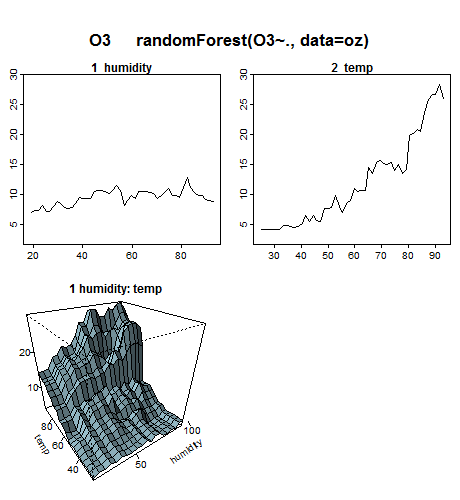
From the plots, we see that ozone increases with humidity and temperature, although humidity doesn’t have much effect at low temperatures.
The top two plots in the above figure are generated by plotting the predicted response as a variable changes. Variables that don’t appear in a plot are held fixed at their median values. Plotmo automatically creates a separate plot for each variable in the model.
The lower interaction plot shows the predicted response as two variables are changed (once again with other variables if any held at their median values). Plotmo draws just one interaction plot for this model, since there are only two variables.
We can generate partial dependence plots by specifying
pmethod="partdep" when invoking plotmo. In
partial dependence plots, the effect of the background variables is
averaged (instead of simply holding the background variables at their
medians). Partial dependence plots can be very slow, but they do
incorporate more information about the distribution of the response.
The plotres function is also included in the
plotmo package. This function shows residuals and other
useful information about the model, if available. Using the above model
as an example:
plotres(mod)which gives
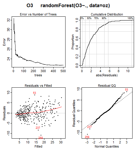
Note the “<” shape in the residuals plot in the lower left. This suggests that we should transform the response before building the model, maybe by taking the square or cube-root. Cases 53, 237, and 258 have the largest residuals and perhaps should be investigated. This kind of information is not obvious without plotting the residuals
More details and examples may be found in the package vignettes:
The package also provides a few utility functions such as
plot_glmnet and plot_gbm. These functions
enhance similar functions in the glmnet and gbm packages. Some
examples:

Any model that conforms to standard S3 model guidelines will work
with plotmo. Plotmo knows how to deal with logistic,
classification, and multiple response models. It knows how to handle
different type arguments to predict
functions.
Package authors may want to look at Guidelines for S3
Regression Models. If plotmo or plotres
doesn’t work with your model, contact the plotmo package
maintainer. Often a minor tweak to the model code is all that is
needed.